
Creating a Web Component With Open-WC
Previously in this series we covered what Web Components are and some tools used to create them. Now, we will be creating a Web Component, publishing it, and use it on a web page.
What will we be making? A keypad component using Material Design Web Components. Building a Web Component made up of Web Components, pretty meta, I know.
The idea is to be able to insert a keypad into a project with as little hassle as possible. With just a couple of lines of code, a user can have a way of inputting numbers into an application to make a phone call, set the temperature, select an answer to a quiz, cast a vote, and many other applications.
Let’s list the features of the keypad component that will be built:
- The out-of-the-box Web Component will render a display and below it, buttons with digits 0-9, *, and #.
- The user will be able to hide the display and the *,# buttons by setting attributes and properties.
- When a user clicks a button, a character will be added to a display. At the same time, a custom event will be sent so that the application outside of the component will know that a button has been pressed.
- There will be an ‘Action’ button that will send all the digits pressed as a custom event for the greater application to process it how it sees fit. The text of the button can be set by the user through a property.
- Another button will be available to the user to ‘End’ the action. Its text will also be customizable. When pressed, the display will be cleared and yet another custom event will be sent to the application to be made aware.
- The Web Component will have a public method made available so the application can switch to the ‘active’ state which then displays the ‘End’ button.
- To add some styling to the Web Component, the Material Design button and textfield components will be used.
See the Web Component in Action
Here’s a working example on CodePen
See the Pen whatever-you-like-keypad by conshus de OUR show (@conshus) on CodePen.
Go ahead and enter some digits and press enter. Click ok on the alert, and then click cancel.
Building Components With Open Web Components
How will we build this keypad component? We will be using lit-html by way of Open Web Components (Open-WC). As stated on their website:
The goal of Open Web Components is to empower everyone with a powerful and battle-tested setup for sharing open source web components. We try to achieve this by giving a set of recommendations and defaults on how to facilitate your web component project. Our recommendations include: developing, linting, testing, tooling, demoing, publishing and automating.
By starting with Open-WC, everyone on a team can have the same starting point to build web components. As with many things, consistency is a factor for success.
Since Open-WC is very opinionated in how Web Components and projects are built, they have a really thorough CLI tool to generate them. Let’s set everything up.
In your terminal, navigate to where the Web Component project will live.
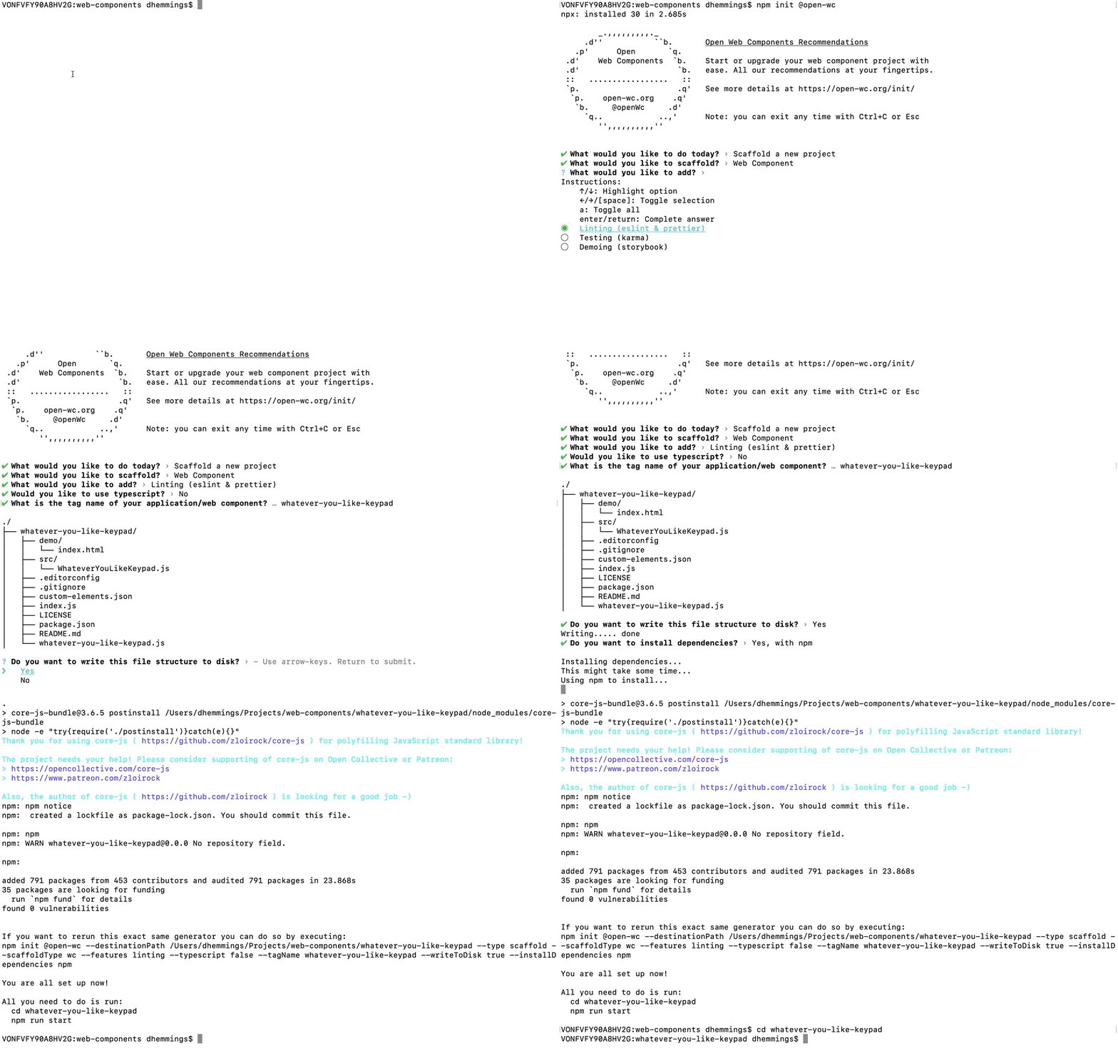
Then, type npm init @open-wc. This will launch the Open-WC setup process.
Here are the options I used for the project in this blog post:
- What would you like to do today?: Scaffold a new project
- What would you like to scaffold?: Web Component
- What would you like to add?: Linting (eslint & prettier)
- Would you like to use typescript? No
- What is the tag name of your application/web component? whatever-you-like-keypad (You can name the Web Component whatever you like as long as it’s at least 2 words separated by a ‘-’)
- Do you want to write this file structure to disk? Yes
- Do you want to install dependencies? Yes, with npm (if you prefer yarn, you can choose that)
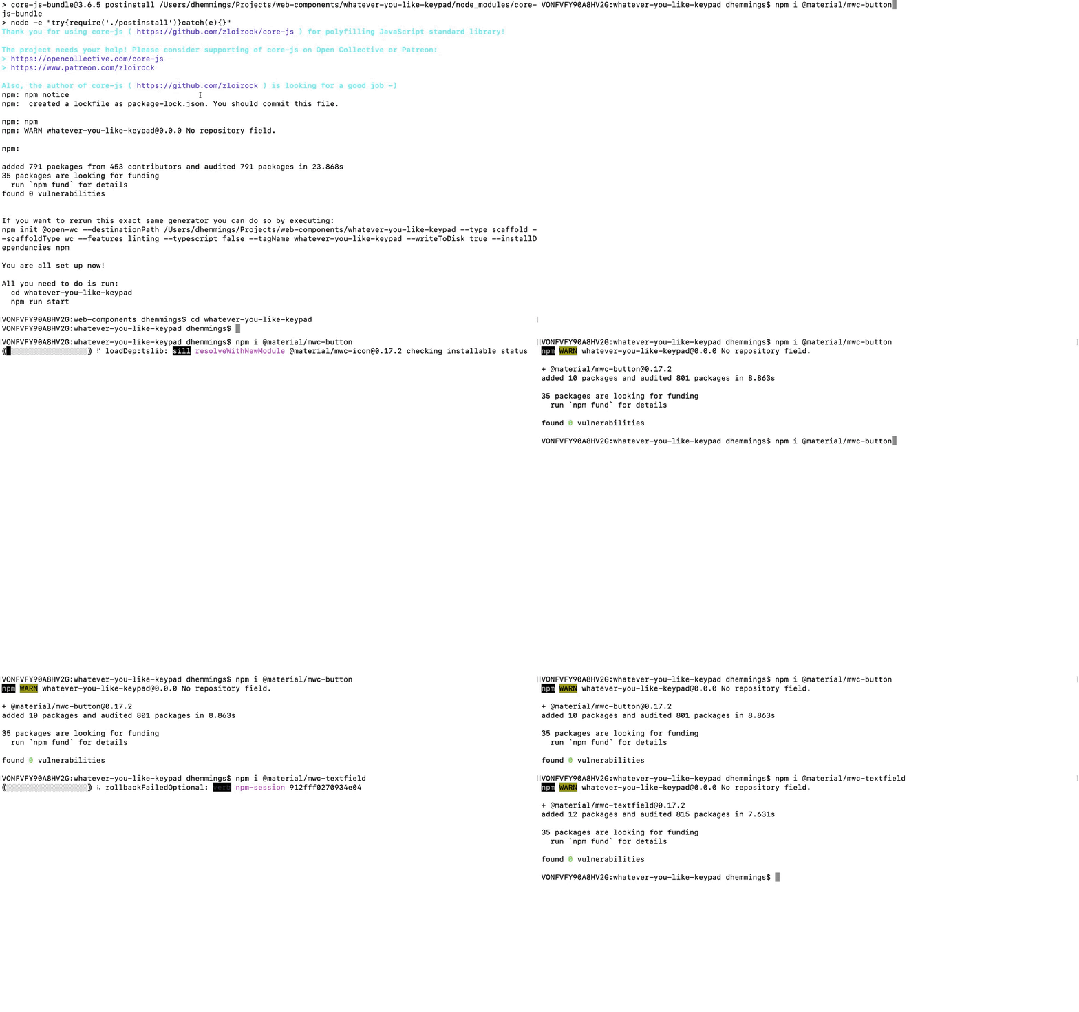
To install the Material Design button and textfield. Go into the new folder created by the Open-WC setup process and type in the following:
npm i @material/mwc-button
npm i @material/mwc-textfield
The Component Code
The code for the Web Component can be found in this GitHub repository. Let’s go through the code in the only file in the src folder.
First are the imports. Open-WC recommends using lit-html and the lit-element base class to build and render the Web Component. We also import the Material Design button and textfield to use in the Web Component.
import { html, css, LitElement } from 'lit-element';
import '@material/mwc-button/mwc-button';
import '@material/mwc-textfield/mwc-textfield';
We base our new Web Component on LitElement.
export class WhateverYouLikeKeypad extends LitElement {
Styling the Web Component
  static get styles() {
    return css`
      :host {
        display: block;
        padding: 25px;
        color: var(--vwc-dialer-text-color, #000);
      }

      #container {
        width: 75vw;
        max-width: 300px;
      }

      .button-row {
        display: flex;
        justify-content: space-evenly;
      }

      .full-width {
        width: 100%;
      }

      mwc-button {
          margin: 10px;
      }

      mwc-textfield {
        --mdc-notched-outline-leading-width: 28px;
        --mdc-notched-outline-leading-border-radius: 28px 0 0 28px;
        --mdc-notched-outline-trailing-border-radius: 0 28px 28px 0;
        width: 100%;
      }
    `;
  }
Here the attributes and properties that the Web Component accepts are set along with their Types. This way, lit-html knows how to handle the values passed in.
  static get properties() {
    return {
      noAsterisk: { attribute: 'no-asterisk', type: Boolean },
      noHash: { attribute: 'no-hash', type: Boolean },
      noDisplay: { attribute: 'no-display', type: Boolean },
      actionText: { type: String },
      cancelText: { type: String },
      actionStarted: { type: Boolean },
      digits: { type: String }
    };
  }
The Web Component inherits all the “super” powers of the LitElement and defines the default values.
  constructor() {
    super();
    this.noAsterisk = false;
    this.noHash = false;
    this.noDisplay = false;
    this.digits = "";
    this.actionText = "Enter";
    this.cancelText = "Cancel"
    this.actionStarted = false;
  }
Next up are the various methods of the Web Component. Things like dispatching custom events when adding or sending digits, and ending an action. There is also the method that can be called on the Web Component that lets it know that an action has started.
  __addDigit(digit){
    this.digits += digit;
    const digitAdded = new CustomEvent('digit-added', {
      detail: { digit },
      bubbles: true,
      composed: true });
    this.dispatchEvent(digitAdded);
  }

  __sendDigits(){
    const digitsSent = new CustomEvent('digits-sent', {
      detail: { digits: this.digits },
      bubbles: true,
      composed: true });
    this.dispatchEvent(digitsSent);
  }

  createAction(){
    this.actionStarted = true;
  }

  __endAction(){
    const actionEnded = new CustomEvent('action-ended', {
      detail: { },
      bubbles: true,
      composed: true });
    this.dispatchEvent(actionEnded);
    this.digits = "";
    this.actionStarted = false;
  }
You may have noticed that the __addDigit function, just adds the digit to the end. If a user moves the cursor to the middle of the digits, new digits will be only added at the end.
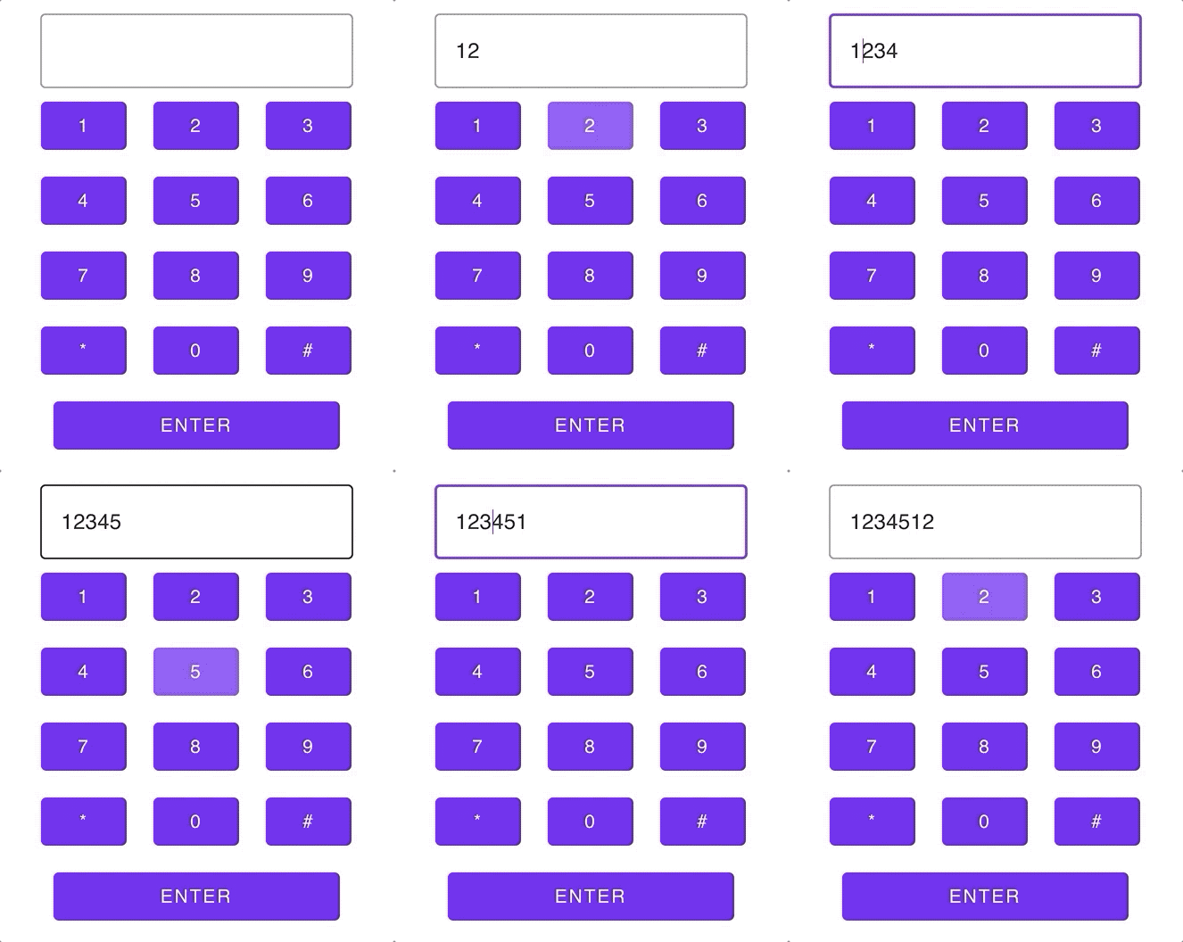
Now, as an exercise, let's allow new digits to be added wherever the cursor is. Here is a hint on where to start.
The markup to render the Web Component. Depending on the state and what attributes/properties are set, the Web Component will render or hide different elements.
  render() {
    return html`
        <div id="container">
            ${this.noDisplay ? "" : html`<mwc-textfield outlined label="" .value=${this.digits}></mwc-textfield>`}
            <div class="button-row">
                  <mwc-button unelevated @click=${()=>this.__addDigit('1')}>1</mwc-button>
                  <mwc-button unelevated @click=${()=>this.__addDigit('2')}>2</mwc-button>
                  <mwc-button unelevated @click=${()=>this.__addDigit('3')}>3</mwc-button>
            </div>
            <div class="button-row">
                  <mwc-button unelevated @click=${()=>this.__addDigit('4')}>4</mwc-button>
                  <mwc-button unelevated @click=${()=>this.__addDigit('5')}>5</mwc-button>
                  <mwc-button unelevated @click=${()=>this.__addDigit('6')}>6</mwc-button>
            </div>
            <div class="button-row">
                  <mwc-button unelevated @click=${()=>this.__addDigit('7')}>7</mwc-button>
                  <mwc-button unelevated @click=${()=>this.__addDigit('8')}>8</mwc-button>
                  <mwc-button unelevated @click=${()=>this.__addDigit('9')}>9</mwc-button>
            </div>
            <div class="button-row">
                  ${this.noAsterisk ?
      ""
      : html`<mwc-button unelevated @click=${()=>this.__addDigit('*')}>*</mwc-button>`
    }
                  <mwc-button unelevated @click=${()=>this.__addDigit('0')}>0</mwc-button>
                  ${this.noHash ?
      ""
      :html`<mwc-button unelevated @click=${()=>this.__addDigit('#')}>#</mwc-button>`
    }
            </div>
            <div class="button-row">
                ${this.actionStarted ?
      html`<mwc-button unelevated fullwidth @click=${this.__endAction}>${this.cancelText}</mwc-button>`
      :html`<mwc-button unelevated fullwidth @click=${this.__sendDigits}>${this.actionText}</mwc-button>`
    }
            </div>
        </div>
    `;
  }
Publishing Your New Web Component
Now that the Web Component is built, let’s publish it so we and others can use it in a project.
To do that, we will use a registry like npm. If you don’t have one already, sign up for an account. Here is some information. This will not only show you how to sign up for an account but also how to log into your account using your terminal so you can publish the Web Component.
Once that is set up, the Web Component will be published as a public scoped package. This will help prevent conflicts just in case there is a Web Component or package with the same name that you chose. More information about scopes can be found here.
In your terminal in the project directory, type (replacing your-npm-username with your npm username):
npm init --scope=@your-npm-username
Accept all the default choices or change as you see fit for each step.
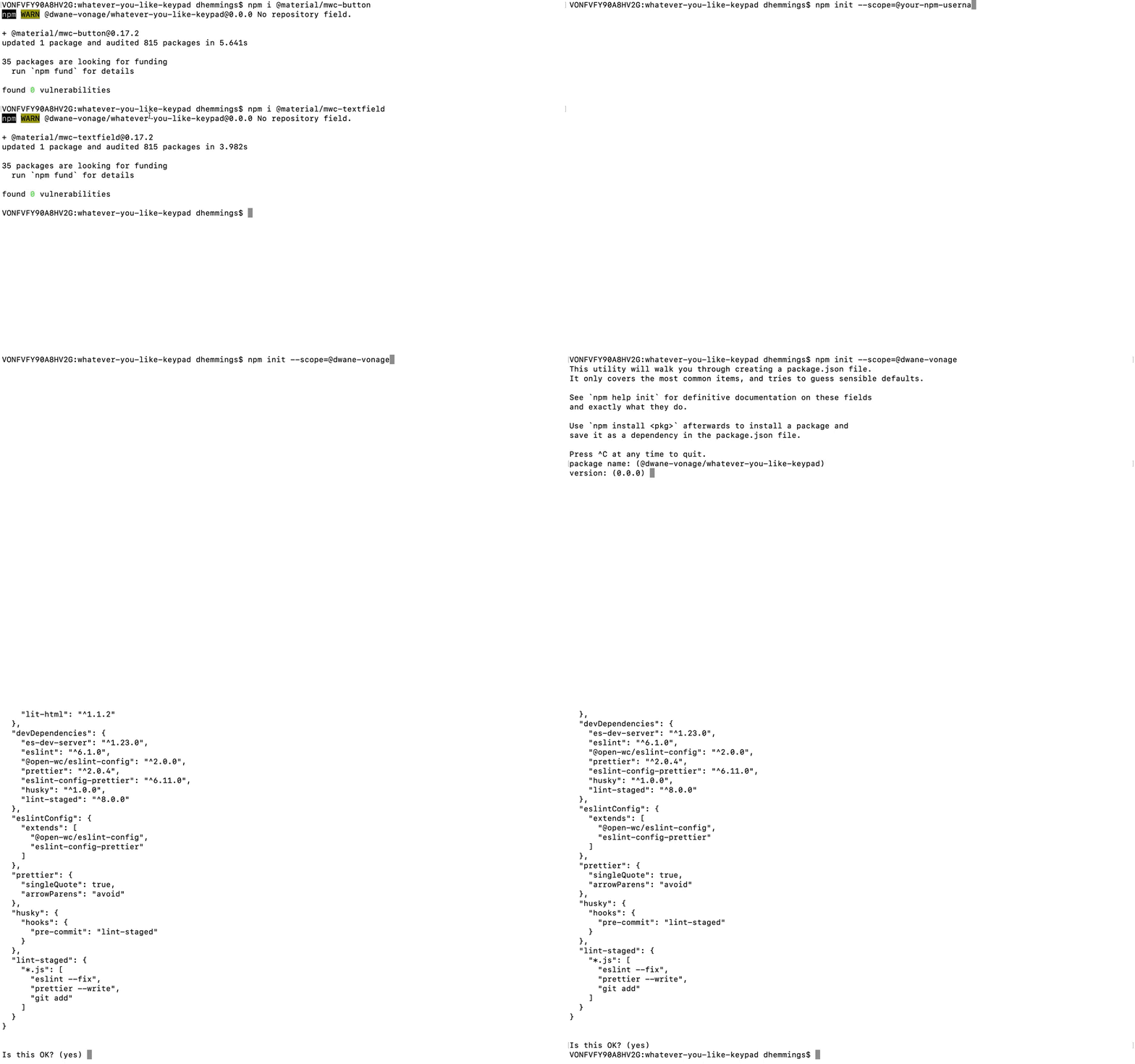
Since your Web Component is now behind a scope, let’s modify the Readme that was generated by Open-WC to reflect that. Again replacing the placeholders (your-npm-username and whatever-you-like-keypad) with your own.
The command to install will be:
npm i @your-npm-username/whatever-you-like-keypad
To use it in a project, you will use the import syntax shown below:
import '@your-npm-username/whatever-you-like-keypad/whatever-you-like-keypad.js';
Save your changes.
Now, let’s publish the Web Component. Type into the terminal:
npm publish --access public
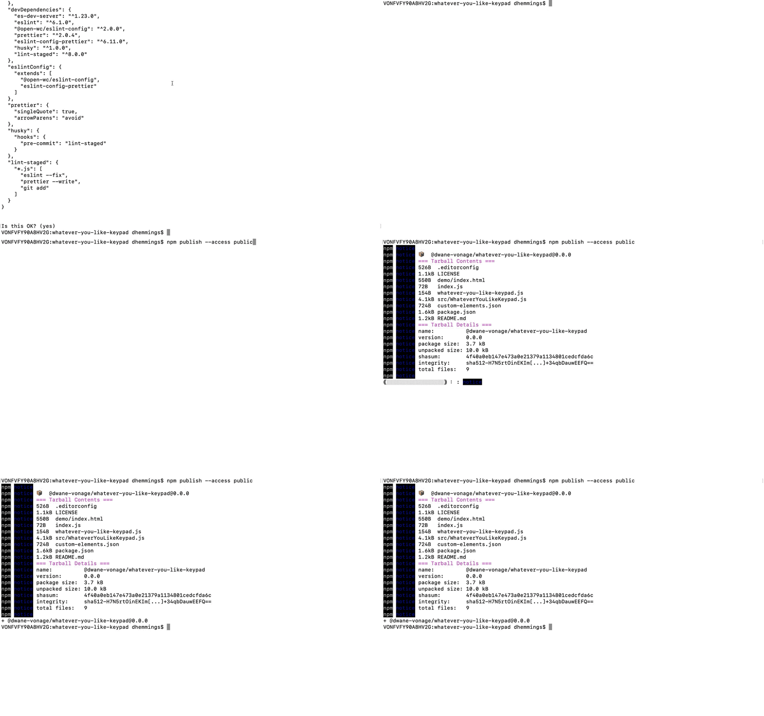
If successful, you should be able to find the Web Component on the npm website at https://www.npmjs.com/package/@your-npm-username/whatever-you-like-keypad.
Of course, replacing your-npm-username and whatever-you-like-keypad with your values.
Congratulations, you are published! You now have a publicly available Web Component that you and others can use in a project.
Using the Web Component
To install a copy locally, type in a project’s directory in the terminal, again replacing with your values:
npm i @your-npm-username/whatever-you-like-keypad
But what if you don't want to install the package? Maybe you want to make sure you always load the latest version or want to see the Web Component in an environment that doesn’t allow installation, like CodePen.
This is where a Content Delivery Network (CDN) comes in. They host your package and you can link directly to your files. For this post, we will use unpkg.com. They automatically copy over your files, so there is nothing to do on your part.
Here is a sample CodePen that you can use to test out your Web Component:
Again replacing the username and component name placeholders with your own in both the HTML and JS tabs.
See the Pen whatever-you-like-keypad by conshus de OUR show (@conshus) on CodePen.
Try adding some of the attributes and properties for the Web Component we created (no-asterisk no-hash no-display) and set the values for the button’s text (actionText="Something" cancelText="Something else").
Note: When using no-display, to see the digits, an input or textarea HTML element will be needed. Like in this example:
See the Pen whatever-you-like-keypad (all options) by conshus de OUR show (@conshus) on CodePen.
What Next?
Now that you have a shiny new Web Component, what else can you add to it? Maybe, add a backspace button that will delete a character or maybe allow the user to set their own buttons. Or maybe just create something brand new.
Leave any links to your Web Component, questions, and/or feedback in our Community Slack Channel. I'm looking forward to seeing what you build.